There is a graphic going around, which people are trying to demonstrate how wasteful we are:
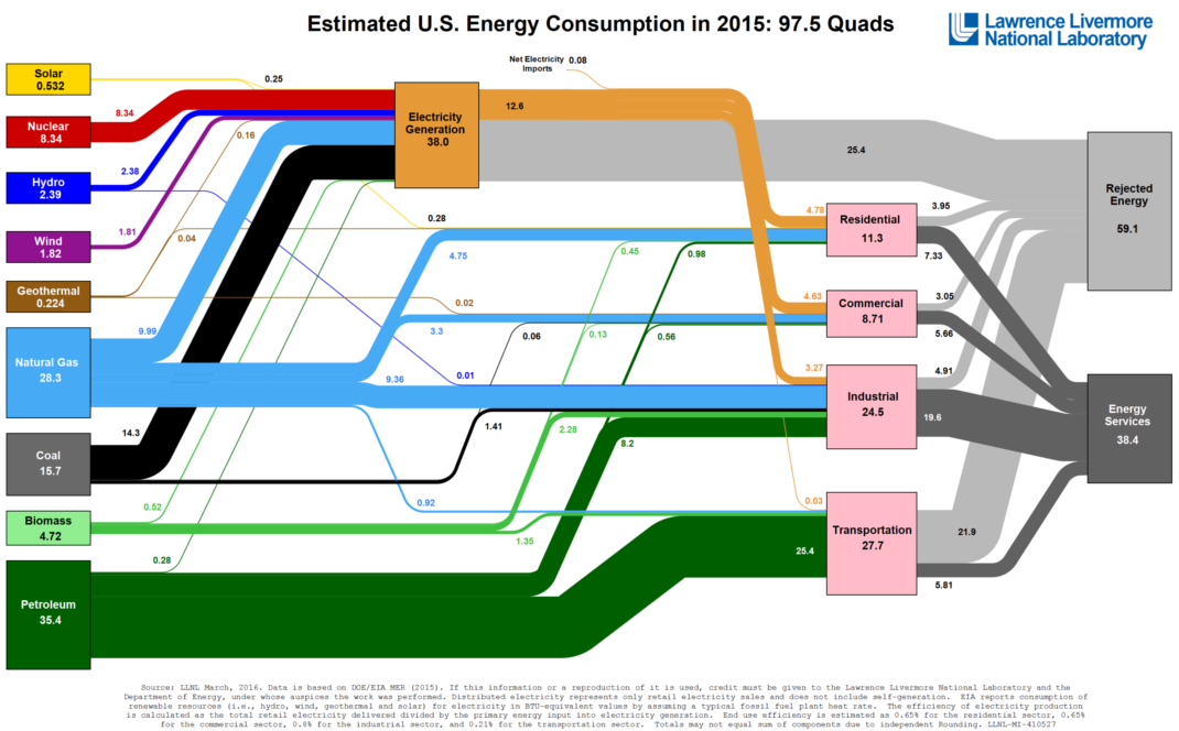
I want to talk about this a bit, and show why that "Rejected Energy" box has to be there.
On the left you see the energy contained in the fuels used to power our economy. These are measured in a unit of heat called "∆H" or Heat of Reaction. Heats of reaction is the measure of how much heat the combustion of that fuel (or how much heat is produced by the process for wind and nuclear).
But the units on the right, the "Energy Services" and "Rejected Energy" boxes, they are measured differently. The "energy Services" box is measured as Gibbs Free Energy, ∆G, but the "Rejected Energy" is measured as Entropy, ∆S.
∆G: Gibbs Free Energy, the maximum amount of work which a process, like burning coal, can produce.
∆H: Heat of Reaction, the total amount of heat generated by a process, like burning coal, when no work is done.
∆S: Entropy, the amount of disorder created by the process. Turning a cold solid coal into a hot gas increases disorder.
All the heat energy of the fuels on the left need to be converted to a form of work. Lighting a bulb, or running a motor, or driving a car, all require work to be done. Heat, ∆H, does not do work. It can only warn things up. Here is the conversion:
∆G = ∆H - T∆S
This is Gibbs Law. What this means is, the maximum amount of work when can be done is found by finding the heat (left side of graph) and subtract the amount of disorder created multiplied by the temperature.
The "Rejected Energy" box is the entropy box, the ∆S box. Most is entropy, but some entropy is created in a way which does no good, so it is energy truly lost. Like delivering electricity heats the wires a bit. Or your car dumps a lot of heat through the radiator and brakes.
The "Energy Services" box is the ∆G box. Useful energy doing work.
Here is what that graph really means: Thick likes can make power rapidly; thin likes cannot. if the ∆S box didn't exist, the ∆G box wouldn't either. All you would have is one huge ∆H box, and heat is all you could enjoy but made at such a low rate that it could not deliver power, only heat. No electricity, no transportation, no manufacturing.
That graph looks exactly as it should, and trying to change it would pretty much send us back to the stone age.
http://www.visualcapitalist.com/u-s-energy-consumption-one-giant-diagram/