Copy and past the annual temperature averages from the Access query into an excel sheet.
You can use a "Scatter with Straight Lines" plot to display the data.
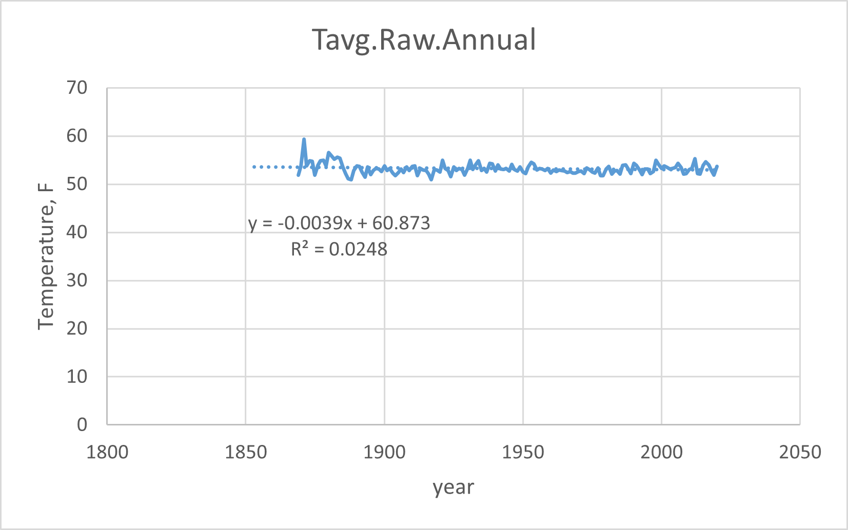
Here is a problem: the data from before 1890 is pretty sparse, and moves around a lot annually. To get a better representation of the trend, it's best to delete it. But that's up to you. What I do is select and cut the deviant data and paste it into the next-door column, so I can put it back if I need to. I'll talk about removing early data in a future post.
Then fit a linear trend, display the trend line and equation. The slope of the trend will be the trend in degrees Fahrenheit per year. If it's negative, the temperature trend is cooling. if it's positive, the trend is rising. Take the reciprocal (1/x) to get the trend slope in number-of-year-to-raise-one-degree.
Here is an example:
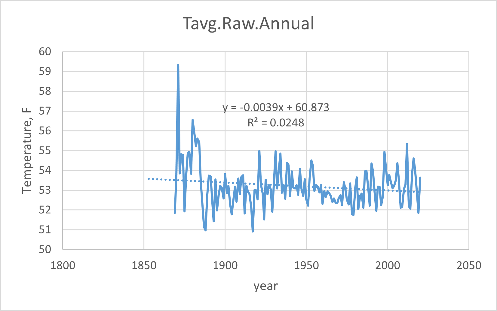
Or you can change the vertical axis to emphasize the ups-and-downs of the data:
I'm selecting the graph, right-click, Save as picture... to save these as .png files.
Next: The differences between the three data sets