There are three USHCN datasets: RAW, TOB, and FLs.52j. I'll discus what each is, and which I will use to observe the US Temperature record.
- RAW is the thermometer high and low recorded for each day, sent in on monthly station sheets. This is recorded as a high and low, Tmax and Tmin, and an average, Tavg = (Tmax- Tmin)/2. The time of day is recorded, and the recording thermometer reset.
- TOB is raw temperature data corrected for the Time of OBservation, to place the high temperature on the correct day if the observation was recorded before the peak temperature of the day. This correction should have no effect on the monthly averages if the time of observation each day is consistent.
- FLs.52j is the result of the "pairwise homogenization algorithm," the PHA. This is version 2.5, 10th (jth) revision. This needs some explanation.
The PHA has been discussed in five papers from 2009 to 2013, all long, all complex. I'll do my best to tell you what they said. Here are the publications, available from the USHCN download site.
- menne-williams2009.pdf (2.06 mb) Introduces the PHA
- menne-etal2012.pdf (4.36 mb) Discusses the PHA-adjusted data from the Global Historical Data Network
- williams-etal2012.pdf (1.61 mb) Benchmarking the PHA with fake data
- vose-etal2012.pdf (1.08 mb) Compares the PHA data to six other PHA-adjusted datasets
- hausfather-etal2013.pdf (801.33 kb) The effect of urbanization on increasing the PHA temperatures
1. Menne and Williams, Journal of Climate, 2009, volume 22, page 1700.
Abstract:
An automated homogenization algorithm based on the pairwise comparison of monthly temperature series is described. The algorithm works by forming pairwise difference series between serial monthly temperature values from a network of observing stations. Each difference series is then evaluated for undocumented shifts, and the station series responsible for such breaks is identified automatically. The algorithm also makes use of station history information, when available, to improve the identification of artificial shifts in temperature data. In addition, an evaluation is carried out to distinguish trend inhomogeneities from abrupt shifts. When the magnitude of an apparent shift attributed to a particular station can be reliably estimated, an adjustment is made for the target series. The pairwise algorithm is shown to be robust and efficient at detecting undocumented step changes under a variety of simulated scenarios with step- and trend-type inhomogeneities. Moreover, the approach is shown to yield a lower false-alarm rate for undocumented changepoint detection relative to the more common use of a reference series. Results from the algorithm are used to assess evidence for trend inhomogeneities in U.S. monthly temperature data.
On the assumption that some stations will change the temperature trend because something around the stations changed (land use changed which causes a jump in the trend, or the thermometer was replaced), the Pairwise Homogenization Algorithm will automatically detect and correct for the jump.
I have a problem with this. Which data set is the best, before the jump, or after? This is a problem with automated data corrections. And this can be a massive correction. Here is the opening paragraph:
Discontinuities in a climate series can be induced by virtually any change in instrumentation or observation practice. The relocation, replacement, or recalibration of an instrument, for example, can lead to an abrupt shift in time-ordered observations that is unrelated to any real change in climate. Likewise, alterations to the land use or land cover surrounding a measurement site might induce a sudden or ‘‘creeping’’ change (Carretero et al. 1998; Karl et al. 1988) that could limit the degree to which observations are representative of a particular region. Such artifacts in the climate record ultimately confound attempts to quantify climate variability and change (Thorne et al. 2005). Unfortunately, changes to the circumstances behind a series of climate observations are practically inevitable at some point during the period of record. For this reason, testing for artificial discontinuities or ‘‘inhomogeneities’’ is an essential component of climate analysis.Often, the test results can then be used to adjust a series so that it more closely reflects only variations in weather and climate.
So, what size of discontinuity are we looking for? A new thermometer, or recalibrating the old, maybe a tenth of a degree. Changing the location of the weather station, maybe a degree, if you move it away from new black tarmac to grass. What size are they correcting? Fourteen degrees! These are massive corrections, as they demonstrate with data from a station in Colorado.
Here is what the PHA does:
The pairwise algorithm is executed according to the following six steps:
- Select a set of "neighbors" for each "target" series in the network, and form pairwise difference series between the target and its neighbors.
- Identify the timing of shifts in all target-minus-neighbor difference series using SNHT.
- Verify each apparent shift identified by SNHT in the pairwise differences (e.g., does the apparent shift look more like a trend?).
- Attribute the cause of shifts in the set of target-minus-neighbor difference series to the various "culprit" series.
- Quantify the uncertainty in the timing of shifts attributed to each culprit series.
- Estimate the magnitude of the identified shifts for use in adjusting the temperature series to reflect the true background climate signal.
It is the assumption behind step 6 that gives me the willies. The "true background climate signal" presupposes that there is a global or continental trend in temperatures, and they seem to be using the adjusted data to show what that "background climate signal" is. They might also be using the results of climate models with heavy CO2 "forcings" (limits in the model by forcing the model to respond to changes in carbon dioxide levels, whether those changes are present or not) to generate that "background climate signal." We'll be testing this below.
The consequence of either the presupposition or the forcing is that the climatologist using this model will need to judge how well the PHA did in "correcting" the data, and that depends entirely on whether or not they think the climate is changing. We have departed from empirical data, and have moved into the home of experimenter bias. This sequence of steps involves choice, and that choice, by a human, cannot be done without moving from observation to fantasy. An idea drilled into my head during my PhD in chemistry: never mess with the data beyond graphing it; only trouble lies beyond. I watched as Steven Ragsdale at Nebraska did exactly this and had to withdraw four papers, two from Science, the most prestigious science journal in the U.S. and two from the Journal of the American Chemical Society, the most prestigious chemistry journal in the world. You never mess with your primary observations and you trust what they tell you.
That they are on version 2.5 revision 10 shows they are messing with the adjustment a lot!
The PHA messes with the primary temperature observations. Let's see how much. Rather than try to critique each paper, which would take me many days and much explaining, lets just look at the data. I'll use the Tavg data, because that includes both the Tmax and Tmin observations.
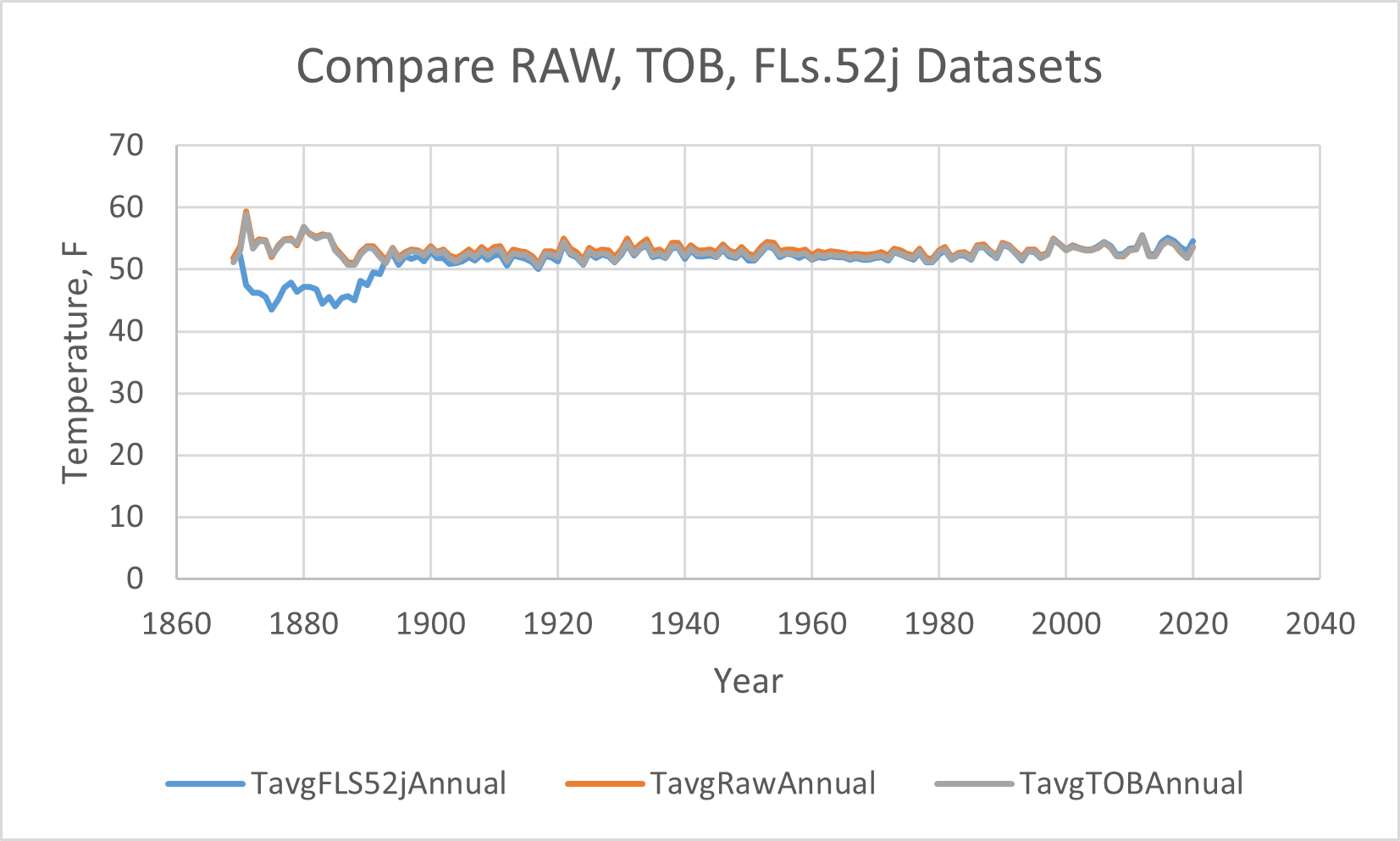
And blow up the vertical axis to see the differences,

That is one crazy "adjustment." The TOB (in grey) has lowered the temperatures from 1890 through about 2004, mostly in the middle of the range, by about 0.6 °F. TOB correction should not have had this dramatic an effect. These are monthly averages, and adjusting the date by one should not have had this large an effect. I suspect they are using their "judgment" to chose which data to shift. You notice no changes by the TOB correction happen after 2004, when the network was digitized and reported each hour.
But the PHA adjustment (in blue) is massive! It's doing two things: dramatically (over ten degrees!) lowering the temperatures in the past, and raising the temperatures since 2004. My biggest problem is with any change happening after 2004 when the thermometers were all good and they had data each hour. Lets take a closer look at the differences, subtracting each adjusted dataset from the RAW observed dataset, where the x-axis represents the raw temperature data, so we can see just how big each adjustment is, year by year:
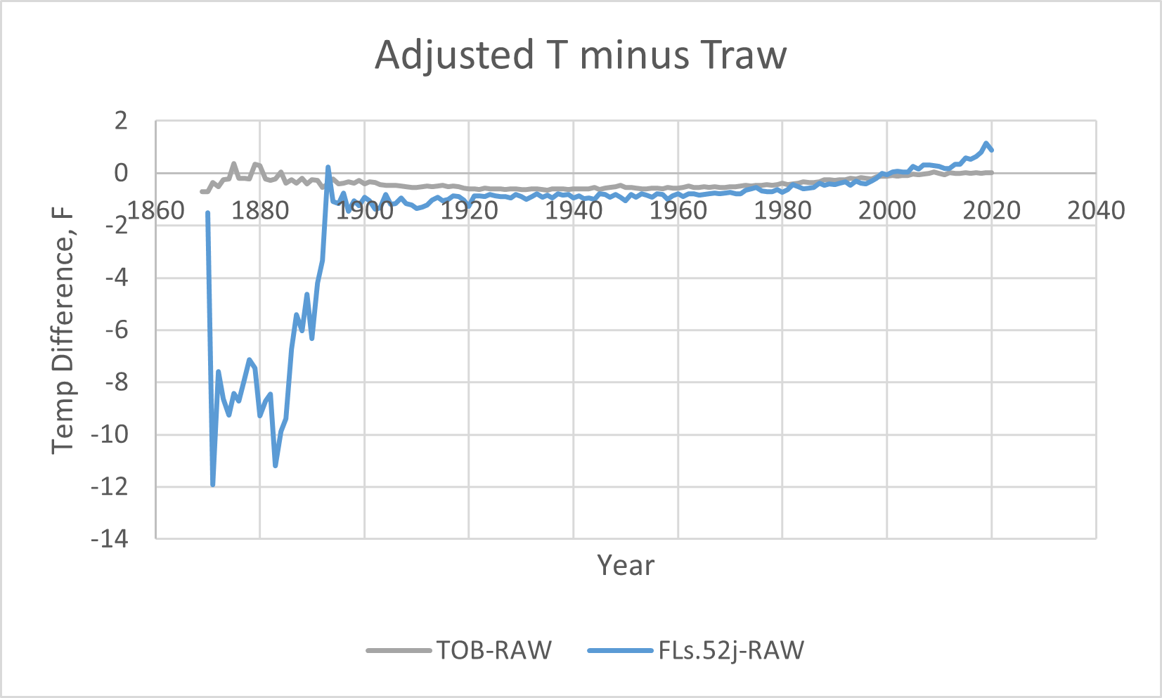
And zooming in,
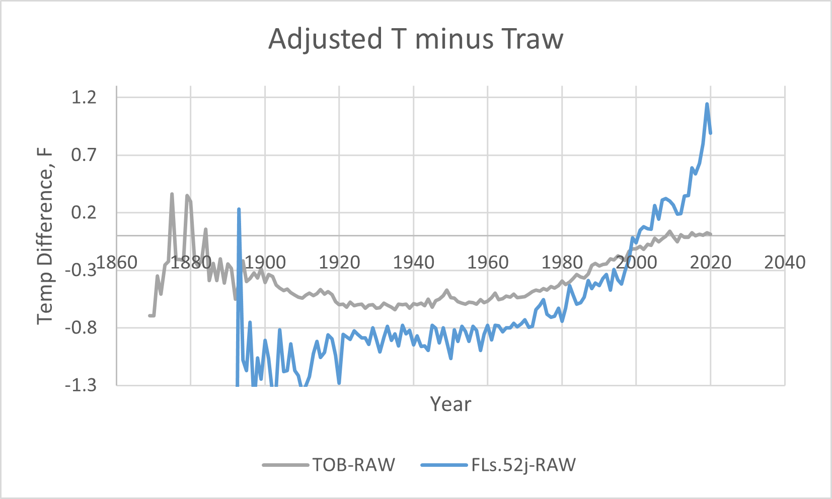
No one can look at these corrections and say, "Oh, that's pretty reasonable." The 12 degree (!) adjustment before 1890 is just crazy, and must be false. That alone disqualifies this data set. But more disturbing is the rest of the correction they applied to the thermometer data to create the PHA dataset. The temperatures before about 2002 are all lowered significantly, and the temperatures after 2002 are all significantly raised, far beyond the thermometer observations. This makes the temperature curve look like it's warming significantly. The PHA adjustment to me looks like climate alarmist wishful thinking. It's just not real. It says that thermometers across the US in 2019 all read 1.2 degrees too low, or if only a subset of bad thermometers are out there, they are reading many degrees too low. The most recent data is the best thermometer data we have, and that correction is growing, not shrinking! That's just not believable.
The TOB adjustment looks hinky to me also, especially since they are making that adjustment well after the automation of the weather stations which report every hour. After automation by 1989, there should be no TOB correction; the adjustment is still there, which means they are adjusting something other than time of observation.
Is the PHA correction the wishful thinking of the climatologists? Lets look at the carbon dioxide concentrations in the air, measured at the Mauna Loa Observatory, Hawaii, as far back as they have measured:
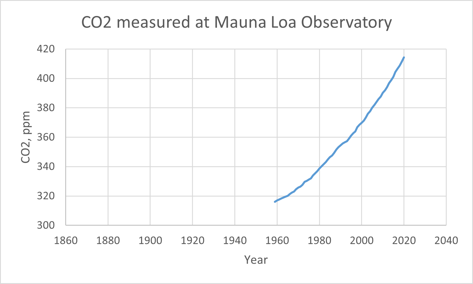
The CO2 curve is the same as the TPHA - TRAW curve! I think the PHA exists only to make the temperature record look like the CO2 curve. The PHA is fake.
I'm going to use only the RAW dataset, the recorded thermometer reading. No fiddling, no adjustments. Just the thermometer readings.
Here is the data, the Access database and the Excel file: USHCN2020.zip (71.80 mb)
Next: what do we do with the data before 1890?